Философия / 4. Философия
культуры
Candidate of Philosophic
Sciences (PhD in Philosophy), lecturer
Griber Yu.
Smolensk State
University, Russia
THE INTERACTION OF COLOUR AND LIGHT
IN THE WORKS OF SMOLENSK ARTISTS:
A QUANTITATIVE ANALYSIS
According to V. Petrov’s theory [1], any artistic tradition implies
fixed dominants: the standard of light and colour and two more colours. All
together they make colour triad. The standard of light and colour of any region
is determined by the geographical peculiarities of sunlight and by the dominant
weather. In the South, where the sunlight is bright and direct, it should be
close to yellow, while the white colour should be typical for the Northern
regions, where the sunlight is weak and scattered. The other two elements of
the triad should be close additional colours.
The article describes the method of measuring for the empirical test of
this theory and for the revelation of the vertical and horizontal
differentiation of colour in the works of art. There are also a quantitative
description of the spectral structure of Smolensk painting and a comparison of
the finding with the structure of Russian national school of painting.
Two groups of experts were involved in developing the method of
measuring. The first group (10 experts) consisted of art critics, art
historians and artists. This group worked in a brainstorm mode. Its task was to
formulate the selection criterion of Smolensk artists and then to make a list
of them. During the discussion of numerous candidatures veto rule was used,
i.e. if any of the experts protested against including a candidate in the list
this artist was excluded. As a result the list consisted only of those artists,
who were approved by all the 10 experts.
Finally the list of artists was made; 508 works of art created since
1920s up till now were selected for the research [2].
The procedure of two-level cluster analysis was used. Smolensk artists
were regarded as clusters (N=100). The selection of paintings was made
according to the number of works of every artist in the museums of Smolensk and
Smolensk Region.
After that the second group consisting of three skilled art critics
began its work. This group was to do the following:
1. To point out, what colour components are present at each picture.
2. To detect the three main colours in each picture that occupy the main
part of it and dominate in its colour structure.
The form of expert judgment was worked out.
The analysis of results was multilevel.
The first level – the assessment of the coordination of the experts’
opinions.
The second level – the study of the number of spectral and non-spectral
colour elements used in the pictures.
The third level – pointing out the dominating colour elements in
Smolensk painting.
In order to check the parameters of the colour triad of Smolensk
painting the experts were to detect the three main colours in each picture that
occupy the main part of it and dominate in its colour structure.
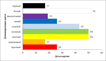
Fig.
1. Spectral structure of Smolensk painting
Statistical distribution (Fig. 1) of the pictures according to each of
the dominating colour elements shows that the usual main colours in Smolensk
painting are white (52%), yellow (50%), green (50 %) and blue (43%).
Comparison with the general traditions of Russian painting school (Fig.
2) shows that Smolensk painting is specific.
The blue colour in Smolensk painting is used more often than in Russia
in general. On the other hand the red colour is less widespread (26% in
Smolensk and 50% in Russia). It is also true of violet (19% and 34%
respectively).
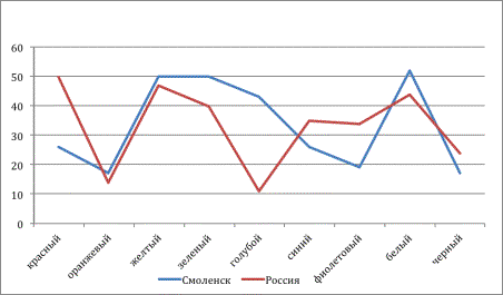
Fig. 2. Comparison with the general traditions of
Russian painting school
In order to reveal the dynamics of colour preference pictures of
Smolensk artists were also analyzed according to the period they were created
in.
The frequency of usage of the spectral and non-spectral elements during
each period in Smolensk painting is represented in the statistic tables.
The research showed that the spectral structure of pictures does not
practically depend on the time of their creation. The statistic diagrams of all
the four periods are almost of the same shape, and their peaks prove that in
different periods the same colours dominated: yellow, green, blue and white.
The standard of light and colour in Smolensk painting corresponds to the
northern variant, it is determined by the scattered sunlight and is close to
white. The colour triad of Smolensk painting consists of white, green and blue
and can be observed in 56% of all the pictures. This value is higher than the
threshold of accidental occurrence. Its pertinence factor is P = 0,95.
On the average in every picture 2,5 triadic colours are used (the
standard aberration is 0,6). Such a high rate proves the reliability of the
identification system of Smolensk painting according to the light and colour
standard and one or two dominating colours (or according to two dominating
colours at once).
References:
1. Петров В.М., Грибков В.С. Конструирование системы живописи. Наложение
социальных «расщеплений» – национальные школы и их цветовые структуры //
Творчество в искусстве – искусство творчества. М.: Наука; Смысл, 2000. С. 339-366.
2.
Грибер
Ю.А. Эпистема цвета в смоленской архитектуре и живописи. Смоленск: Маджента,
2008. 296 c.