Pedagogical and technological design of electronic
educational editions in an education system
Kazhikenova
S. Sh., Rahimbekova A.A.
Karaganda State University E.A.
Buketov
In modern society informatization of
education covers all directions of educational activity therefore creation of
electronic training materials and their use became a component of educational
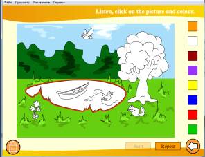
process in general. Use of electronic training materials creates comfortable
conditions for training in the computer environment, habitual for the younger
generation. Preparation of such materials in an electronic form easier is
perceived by the prepared users and there is no division of information space
into segments of active use of information products for leisure and training.
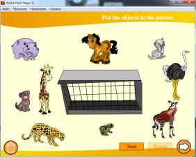
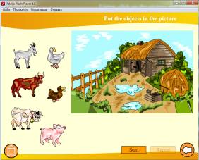
Work on design of electronic
educational editions is connected with creation of the interface of the
training system, to the available user and educational information, convenient
for assimilation allowing "to travel" easily on structure of the
textbook and each of trained individually to determine the volume of
educational information on this or that plot.
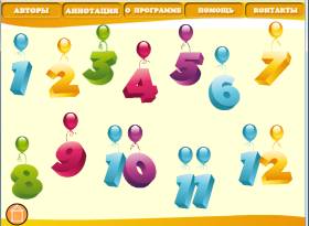
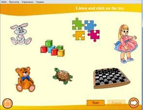
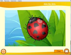
Components of the electronic
edition: texts, illustrative material, soundtrack, animation and video. Registration
of the textbook has to be exclusively functional. In this regard it is worth
paying special attention to its design.
The perception the student of
the material stated in the electronic textbook depends not only how it is
picked up and in what sequence material moves; what style, and in what manner
wrote the textbook but also as it is issued.
At a choice of color scale of
the electronic textbook it is necessary to observe harmony of flowers. Numerous
researches of the most comfortable combinations of flowers at a conclusion of
data to the display screen, revealed a number of parameters for an assessment
of quality of display.
One of the main is the clearness of perception of color images. Up to the last time was considered that the
white background is ineffective in comparison with other colors. However with
the advent of the high-quality displays having high resolution it became clear
that efficiency of the operator who is reading out black letters on a white
background is one third higher, than at working at the color monitor.
Perception
of color images on an achromatic background
|
Color of symbols |
Color of a background |
||
|
Black |
Grey |
White |
|
|
Red |
Bad |
Excellent |
Good |
|
Blue |
Bad |
Bad |
Good |
|
Green |
Excellent |
Bad |
Bad |
|
Cyan |
Excellent |
Bad |
Bad |
|
Crimson |
Excellent |
Bad |
Excellent |
|
Yellow |
Good |
Excellent |
Bad |
Perception of color images
on a color background
|
Color
of symbols |
Color of a background |
|||||
|
Red |
Blue |
Green |
Cyan |
Crimson |
Yellow |
|
|
Red |
- |
Bad |
Excellent |
Good |
Bad |
Good |
|
Blue |
Bad |
- |
Excellent |
Good |
Good |
Good |
|
Green |
Bad |
Excellent |
- |
Excellent |
Excellent |
Excellent |
|
Cyan |
Excellent |
Excellent |
Bad |
- |
Excellent |
Excellent |
|
Crimson |
Bad |
Excellent |
Excellent |
Excellent |
- |
Good |
|
Yellow |
Excellent |
Good |
Excellent |
Excellent |
Excellent |
- |
The feelings of the person
caused in various colors
|
Color |
Feeling of space |
Feeling of temperature |
Emotional state |
|
Red |
Next, close |
Hot |
Worry |
|
Orange |
Too close |
Warm |
Enthusiasm |
|
Yellow |
Close |
Warm |
Cheerfulness |
|
Green |
Distance |
Neutral |
Calm |
|
Blue |
Far |
Cold |
Calm |
|
Purple |
Too far |
Cold |
Tiredness |
However for the manual the
black text on a white background is a standard, but not the best option as
strong contrast of colors attracts additional fatigue of the trainee. It is
possible to avoid it simple selection of color couple the text - a background.
Is suitable for color of the
main text universal black though also options are possible (dark brown, dark
blue etc.) better. For a background it is necessary to use soft pastel tone,
and not continuous filling of a background in the chosen color, and a soft
out-of-focus textural background gives the best visual effect.
Within one thematic section
color and texture of a background have to remain constants for all pages. Any
three colors going one after another on a color circle from 12 parts can become
a basis of harmony. The combination flavovirent, yellow and yellow-orange can
become an example of an analog combination. As a rule, one of shades dominates.
Any two colors
which are located on the opposite sides of a color circle, for example, the
blue-orange. Complementary combinations provide the maximum contrast and
stability of design. Decrease of a saturation of the making color lowers
contrast, but supports balance of composition.
Any color plus two colors
lying at the edges of complementary to it colors. Yellow plus red-violet and
blue-violet can be an example of a similar combination. The similar combination
softens contrast of the complementary color scheme.
Colors
of a similar combination lie at tops of the isosceles triangle placed inside a
color circle. The combination red, blue and yellow can be an example of similar
harmony.
Similar harmony is based on any analog combination
plus color which is complementary to average color of the chosen analog scheme.
Combination
of two couples complementary colors when the square or a rectangle is formed.
Any
color in combination with black, white and (or gray). For example
red-black-and-white combination. Similar schemes are exclusively dynamic
because of highly contrast of dark and bright areas, the chromatic and the achromatic
of shades. It should be noted, however, that use of very light or very muffled
colors will be less successful.
When developing design of the electronic textbook at
first it is necessary to decide on color scale, use no more than 4 primary
colors is optimum.
On process of perception (so, and understanding) the
text located on the display screen the whole set of factors, such as width of a
text zone, a way of alignment of the text, its arrangement on the screen page,
a tracing, style and a font size influences.
All variety of the available fonts it is possible to
divide into two big groups: serif types (Serif, for example Times New Roman)
and smooth fonts (San Serif — without notches, for example Arial). According to
psychologists, the serif type is read easier as to an eye is for what "to
be hooked" when reading the text — notches as if serve directing for
movement of an eye on letters, and he is tired less.
Visually on the screen text information can be
allocated in several ways: place of its arrangement, background, font, its
tracing and in the color.
Nevertheless is suitable for color of the main text
universal black though also options are possible (darkly brown, darkly blue and
so on) better. And here color of its workmate depends on the general chosen
color scale.
You shouldn't apply to allocation (semantic emphasis)
of fragments of the text the colors which are sharply contrasting with the main
text. It is quite enough to use shades of one color, different in saturation. And
as the saturation can be regulated visually the size and a type face (normal,
bold, italic), the quantity of options of color can also be limited.
The world round us consists of a huge number of
objects, forms, paints, sounds various, excellent from each other. At first
sight it seems that the similar variety has to be chaotic, but isn't present,
the nature strives for harmony, balance. The task of the designer is somewhat
similar to a task of the founder of this world - to reach balance, harmony of
composition.
Literature
1.Vul В.А. Electronic edition: Studying book.
– SPb.:BHV-Petersburg, 2003. – 352 p.
2.GOST 7.60–2003 «Editions. Main types. Terms and difinitions»
3.GOST 7.83–2001 «Editions. Main types and datas»
4.Grechihin А.А., Drevs Yu.G. Higher educational
book: Studying methodical book. – М.: Logos; Moscow state university of publishing, 2000.
– 255 p.
5. Signature
stamp of educational editions//University book.2010. № 4, P. 34 – 41.
6. Encyclopedia
of book business / Maysuradze Yu.F., Milchin A.E., Gavrilov E.P. etc. – M.: Юрист,1998. – 535 p